
You know how we’re always hopping between gadgets to browse websites? That’s where responsive web design comes in – it’s like the superhero of web design. It makes sure your website looks fantastic no matter if you’re using a phone, tablet, or a big computer screen. It’s all about giving everyone the best experience, no matter what device they’re using. So, hang tight as we dive into the nitty-gritty of responsive design in this guide.
Understanding Responsive Web Design
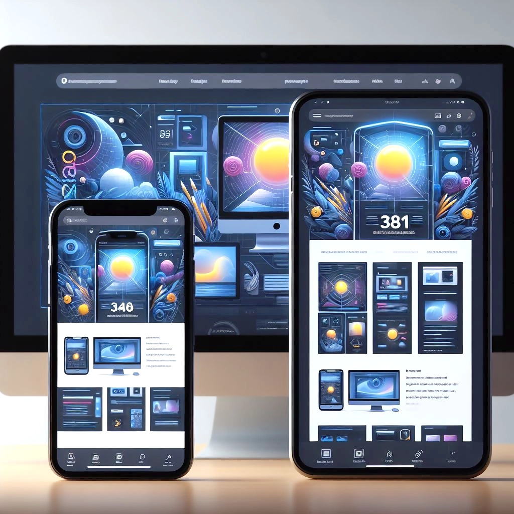
Responsive web design isn’t just a trend; it’s a necessity. It’s an approach that prioritises user experience by creating layouts that fluidly adjust and evolve with different screen sizes. From desktop monitors to smartphones and everything in between, responsive design ensures your website looks and functions impeccably.
Benefits of Responsive Design
- Enhanced User Experience: Users demand a seamless experience, whether they’re browsing on a large desktop monitor or a tiny smartphone screen. Responsive design ensures your content remains accessible and readable, leading to higher user engagement and satisfaction.
- Improved SEO Performance: Search engines favor responsive websites, as they provide consistent content across devices. This can lead to improved search rankings and increased organic traffic.
- Cost-Effectiveness: Rather than creating separate versions of your website for different devices, responsive design allows you to maintain a single site, reducing development and maintenance costs.
- Higher Conversion Rates: A positive user experience translates to higher conversion rates. When users can easily navigate and interact with your site, they’re more likely to take desired actions.
Best Practices for Achieving Responsive Design Excellence
- Start with Mobile-First Design: Begin the design process with the mobile version in mind. This ensures that your site’s essential elements are prioritised for the smallest screens, preventing clutter and optimising the user experience.
- Flexible Grids and Layouts: Employ fluid grids that use relative units (percentages) for layout components. This allows content to adapt smoothly across various screen sizes.
- CSS Media Queries: Utilise CSS media queries to apply different styles based on the screen’s width. Media queries enable you to define breakpoints where the design changes to accommodate different devices.
- Optimise Images: Images are a crucial part of web design, but they can slow down load times on mobile devices. Use responsive images that are appropriately sized and compressed to ensure fast loading.
- Testing Across Devices: Thoroughly test your website on real devices to identify any layout or functionality issues. Browser developer tools and online testing platforms are valuable resources for this step.
- Typography Considerations: Choose fonts that are legible on small screens and adjust font sizes using media queries. Maintain consistency across devices while ensuring readability.
- Navigation Design: Simplify navigation for mobile devices. Consider using collapsible menus or icons to conserve screen space and enhance user experience.
- Performance Optimisation: Keep loading times in check by minimising the use of large files and unnecessary scripts. Compress and minify code to ensure swift page loading.
- User-Centric Approach: Put yourself in the user’s shoes. Prioritise content that’s most relevant and valuable for mobile users.
- Regular Updates and Maintenance: Responsive design isn’t a one-time task. As new devices and screen sizes emerge, consistently update and refine your design to maintain optimal responsiveness.
Conclusion
Now, responsive web design isn’t just about making things look good. It’s all about creating an online playground where everyone has a blast. It doesn’t matter if you’re tapping on your phone or chilling in front of your computer – responsive design ensures that your website is a joy to use. By grasping the main ideas and sticking to the cool techniques, you’ll hit the bullseye with responsive design. Start with the whole “mobile-first” vibe, play around with flexible layouts, tinker with CSS media tricks, and give your images and content a performance boost. And guess what? Regular checks and updates will keep your site rocking, no matter how the digital world changes. With responsive design as your trusty sidekick, you’ll create a website that totally rocks – no matter how folks drop by.

 ABN: 58 196 482 040